I have been an enormous film buff all my life. I love silent films, epic Technicolor extravaganzas, musicals, horror films, sci-fi, action…you name it. I love them all. Something I’ve noticed is that while hairstyles and fashions come and go at breakneck speed in life and in the movies, the language of film evolves rather than reinventing itself. Every generation, new directors make nostalgic homages to the films of the generation before, and, over time, certain things have become tropes. Using the hard lighting made famous by American Noir in the 1930s and French Noir in the 1960s (itself an homage to the American films) tells audiences around the world a great deal. As post production manipulation became easier, films took on a more and more clear color palette: the orange tones of human flesh and the blue-green tones of sea and sky. Orange and teal are complementary colors, and the combination works really well to make actors onscreen pop against the background. Google search teal and orange in the movies and you’ll find a dozen other blog posts and articles about this phenomenon.
There are other colors, too, denoting genre: Horror movies tend towards blue. Post-apocalyptic films are washed out and grey. Movies about the boundaries of reality, like The Matrix trilogy and “Fight Club” are green. When you’re sitting in a movie theater watching trailers, you know what kind of film is being advertised by shots of the footage. You don’t really need to hear the “In a world…” statement. Heavy color correction tells you it’s a genre film, and the color of correction tells you what genre. Crazy, right?
The fun doesn’t stop there. Movie posters have a secret language, too, and some of the syntax dates back for decades. You’ll find a pretty comprehensive gallery of examples here. Warning- once you see this, it will be hard to stop seeing it every time you go to the theater! You already know the language, though. Here’s an example:
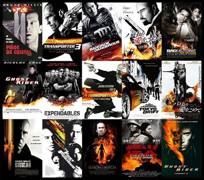
Black and white with explosions and/or fire? I don’t need to tell you what kind of movies these are – you already know! It’s a language we all speak, and it’s been spoken since long before there were movies.
The Smithsonian has a website devoted to symbolism in art and it is gloriously teal and orange in color! The example activity features art of the ancient world. Thousands of years later, millions of people still understand the tropes of the Greek goddesses!
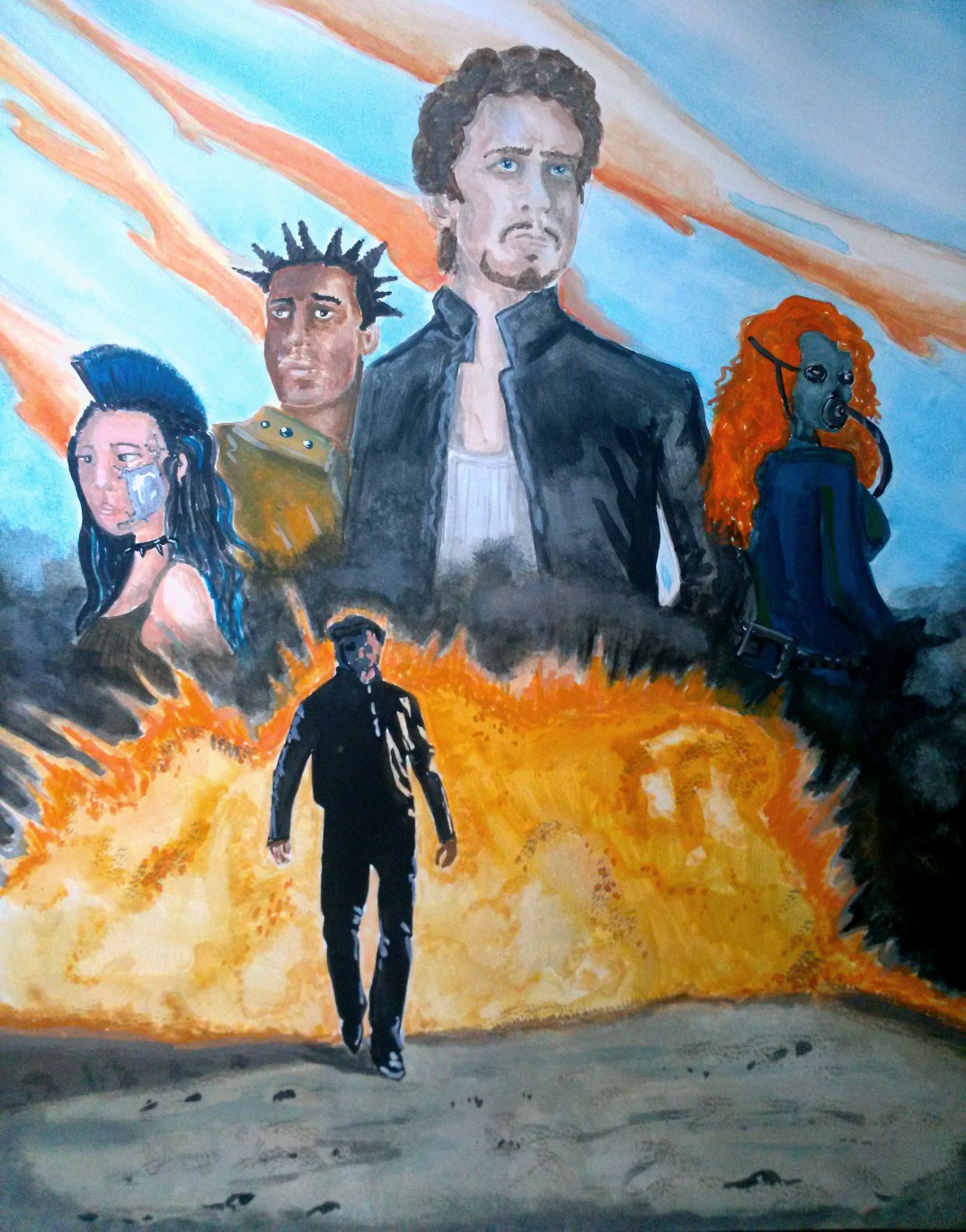
I wanted to play with Hollywood movie poster tropes specifically as a complementary color study. This past fall, I was taking a fundamentals course at my local community college and I found the perfect opportunity. I used teal, orange, black and white gouache paint to create an homage to a movie poster. I used a combination of tropes – The hero coolly walking away from a fireball, the character sized in order of importance, and the tough-love romantic interests standing back to back. I also made a point to break one particularly insidious Hollywood trope: whitewashing. Most actors are white. When actors are not white, a myriad of tricks are used to make them appear more white in posters. So I featured Asian, Black and Hispanic people with significantly different skin tones. The only character with undeniably white features (red hair) is wearing a gas mask. Of course, the gas mask, clothes and hairstyles are telling you quite a lot about the film’s genre, character personalities and even a little bit about the plot, too.

